
Friday, May 4, 2012

Wednesday, April 25, 2012
Wednesday, April 4, 2012
Commercial Idea
My commercial will begin with a man or woman sitting at a cubical in their office zoned out. Then a dream bubble pops up (showing man/woman sitting at desk with a thinking cloud above). In the dream bubble will be a picture of one of the entrees I used in my brochure. The man/woman will start drooling and then it will quickly transition to a flash mob outside or inside of Couch Potato. It will then end with a flash back to him/her dreaming at his/her desk smiling.
Tuesday, April 3, 2012
Commercial Evaluations
1. Madden NFL '12
Visual style?
-Black and white, live action/slow motion
Tone?
-Funny
Product?
Madden NFL '12
Target Audience?
-Boys who play video games.
What is the problem that the product is solving?
-Boys older brother is teasing him
How does the commercial talk about these problems?
- Ends with younger brother beating him in Madden
Narrator?
-Yes, voice over is Ben Affleck.
Do you feel the commercial is successful, why?
Yes, the first time I saw this commercial on TV I instantly knew it was Ben Affleck's voice and although I'm not interested in the product, I was interested in the commercial.
2. K9 Advantix
Visual style?
-animated
Tone?
-happy
Product?
-K9 Advantix
Target Audience?
-People who own dogs.
What is the problem that the product is solving?
-Fleas
How does the commercial talk about these problems?
-Commercial uses a song to discuss these problems.
Narrator?
-Yes, voice over.
Do you feel the commercial is successful, why?
-Yes because it is a very memorable commercial, the puppy is really cute and makes you want to watch.
3. Red Bull
Visual style?
-stop motion or animated
Tone?
-funny
Product?
-Red Bull energy drink
Target Audience?
-Females
What is the problem that the product is solving?
-Lack of energy
How does the commercial talk about these problems?
-The Zebra is clearly a girly girl, she gets attacked by an alligator, gets pulled under and comes out of the water walking fine holding her purse smiling.
Narrator?
-Off screen
Do you feel the commercial is successful, why?
-Yes I found it to be some what commical
4. 5-Hour Energy
Visual style?
-Live action
Tone?
-mellow
Product?
-5 Hour Energy
Target Audience?
-Business Professionals
What is the problem that the product is solving?
-Being tired
How does the commercial talk about these problems?
-Shows people at work being exhausted and attempting to use coffee to wake them. Then ends with them using 5 hour energy instead and not being tired, instead being very productive.
Narrator?
-On screen
Do you feel the commercial is successful, why?
-Yes it validly portrayed why 5 hour energy is a better alternative to coffee.
5. Geico
Visual style?
- Live action/ animated
Tone?
-funny
Product?
-Geico mobile app
Target Audience?
- Geico customers
What is the problem that the product is solving?
- Being able to check your insurance on the go
How does the commercial talk about these problems?
-Shows people in risky situations without the app then reiterates why people should get the app at the end
Narrator?
-both on and off screen
Do you feel the commercial is successful, why?
-Not really, didn't make that much sense
Visual style?
-Black and white, live action/slow motion
Tone?
-Funny
Product?
Madden NFL '12
Target Audience?
-Boys who play video games.
What is the problem that the product is solving?
-Boys older brother is teasing him
How does the commercial talk about these problems?
- Ends with younger brother beating him in Madden
Narrator?
-Yes, voice over is Ben Affleck.
Do you feel the commercial is successful, why?
Yes, the first time I saw this commercial on TV I instantly knew it was Ben Affleck's voice and although I'm not interested in the product, I was interested in the commercial.
2. K9 Advantix
Visual style?
-animated
Tone?
-happy
Product?
-K9 Advantix
Target Audience?
-People who own dogs.
What is the problem that the product is solving?
-Fleas
How does the commercial talk about these problems?
-Commercial uses a song to discuss these problems.
Narrator?
-Yes, voice over.
Do you feel the commercial is successful, why?
-Yes because it is a very memorable commercial, the puppy is really cute and makes you want to watch.
3. Red Bull
Visual style?
-stop motion or animated
Tone?
-funny
Product?
-Red Bull energy drink
Target Audience?
-Females
What is the problem that the product is solving?
-Lack of energy
How does the commercial talk about these problems?
-The Zebra is clearly a girly girl, she gets attacked by an alligator, gets pulled under and comes out of the water walking fine holding her purse smiling.
Narrator?
-Off screen
Do you feel the commercial is successful, why?
-Yes I found it to be some what commical
4. 5-Hour Energy
Visual style?
-Live action
Tone?
-mellow
Product?
-5 Hour Energy
Target Audience?
-Business Professionals
What is the problem that the product is solving?
-Being tired
How does the commercial talk about these problems?
-Shows people at work being exhausted and attempting to use coffee to wake them. Then ends with them using 5 hour energy instead and not being tired, instead being very productive.
Narrator?
-On screen
Do you feel the commercial is successful, why?
-Yes it validly portrayed why 5 hour energy is a better alternative to coffee.
5. Geico
Visual style?
- Live action/ animated
Tone?
-funny
Product?
-Geico mobile app
Target Audience?
- Geico customers
What is the problem that the product is solving?
- Being able to check your insurance on the go
How does the commercial talk about these problems?
-Shows people in risky situations without the app then reiterates why people should get the app at the end
Narrator?
-both on and off screen
Do you feel the commercial is successful, why?
-Not really, didn't make that much sense
Wednesday, March 21, 2012


Monday, March 19, 2012
Letterhead

Wednesday, March 14, 2012
Business Card
 |
| Front |
 | ||
| Back |
For the front of the business card, I inserted my logo from the last project by selecting file and then place. For the background I used the rectangle tool and made the color black. For the back I inserted the image of the potatoes and cropped it to position it the way I wanted it. For the background I did the same thing as I did for the front, used the rectangle tool and made the color black. For the text, I used the eye dropper tool to get the same exact color as the red in the logo and then centered it. I chose a font different from the logo because I wanted it looked more professional.
Tuesday, March 13, 2012


Wednesday, February 29, 2012
Corporate Idenity Questions
1) What is your business?
A dine in and out restaurant.
2) Describe your business in one sentence
Couch Potato is a dine in and out restaurant that serves potatoes cooked in different forms (mashed potatoes, tater tots, french fries, baked potatoes ect.) and allows you to choose from tons of different toppings (sour cream, bacon, cheese, vegetables ect.) to add to your potato dish.
3) Who is your target audience?
Families, business professionals, teenagers, people of all ages.
4) Who are your competitors?
Other dine in and out restaurants in the area (ex: Restaurants such as Fresh)
5) What makes them better/worse than your product/service?
Couch Potato is original and offers a unique genre of food that no company I've heard of has done before. Fresh (NYC) serves only sandwiches, salads and pasta. I searched potato bars into Google and most were in random states such as Idaho, Virgina, Oklahoma. My company would be based in New York City.
6) Do you currently have an identity? (This is more for companies that are already established and you’re just revamping the logo/corporate identity. If you have a new company or product, skip this question.)
No.
7) (If your answer to #6 is no, skip this question) What do you like about it and what don’t you like about it?
No.
8) How do you want your image to be seen in two years?
I want this company to be seen as a restaurant that consistently creates the best quality food to keep customers wanting to come back again.
9) If your company was an animal, what animal would it be and why?
A goat, because it is a farm animal which represents the feel of natural products.
10) If your company/brand was a person, who would it be and why?
A farmer, to inform/give the public the idea that we use all natural, organic potatoes.
11) If your company/brand was an object, what would it be?
A potato.
12) If your customer was a cartoon character, who would it be?
Mr. Potato Head, because he's a potato, he's known all throughout the U.S. and is a friendly welcoming cartoon character.
Monday, February 27, 2012
Project 3 Lyrical Collage

Wednesday, February 15, 2012


Monday, February 13, 2012
Vector Illustration
 |
I chose to do a photo of a pair of heels because I love shoes. I started by outlining each segment of the shoes on different layers. I first began with the red bottoms on one layer, the heel on the next layer then the left sides of each shoe and then the right sides of each shoe. To create the reflection appearance that is showed in the original picture, I used the mesh tool. |

Wednesday, February 1, 2012
Final Logo
I chose this design because I want the restaurant to come across as your classic all American dine in and out restaurant. I didn't want to make the logo appear classy because it is a casual and inexpensive place that welcomes people of all ages. Since the logo incorporates a potato (which are brown) I felt that the more saturated red went nicely with the black and brown. When viewed from a far, the sign is still completely visible and readable.
Monday, January 30, 2012

Sketches
 |
| This sketch seemed to target an older crowd, the font would be thicker in the actual final product. |
 |
| This sketch |

 |
| This sketch comes across as a more fun and friendly approach. |

Wednesday, January 25, 2012
Logo Critiques Part 2

Mozilla Firefox is another very recognizable logo. The logo perfectly explains what the company does by showing the world which is a common symbol for the web (ex: internet explorer) and incorporating their trademark, the fox. I agree with the colors they used because orange and blue aren't colors you wouldn't really think would look nice together, but they pulled it off.
Apple is probably one of the most recognized logos world wide. Back when Apples weren't the dominant computer of choice their symbol wasn't as classy looking, having the apple colored rainbow. Now that they are a luxury brand the silver was a great choice to show that their products are now top choice in the market.
Logo Critiques part 1

I think that the Target logo is one of the most easily recognizable logo's without having to show its company name. The fact that their logo is a picture of a target, what their company name actually is, allows them to not always have to incorporate their company name into their advertisements. I agree with their color choice because red is a color that is so bright and noticeable that it almost forces people to look at it. I also feel that this logo doesn't target just women, men or kids seeing as their is not enough detail to argue that it does so.
I really like the Volkswagen symbol, and how they use another 2 V's to make the W, I think it makes it look really nice. The shade of blue that they chose is original and simple and could also be considered a blue for guys and girls.
The Nickelodeon logo is one that is very distinct from any other logo I would recognize. I feel that it comes across as fun and definitely captures their target market which is children. The shade of orange they chose is not aggressive but not too dim either.
Monday, January 23, 2012
Fictional Company Ideas
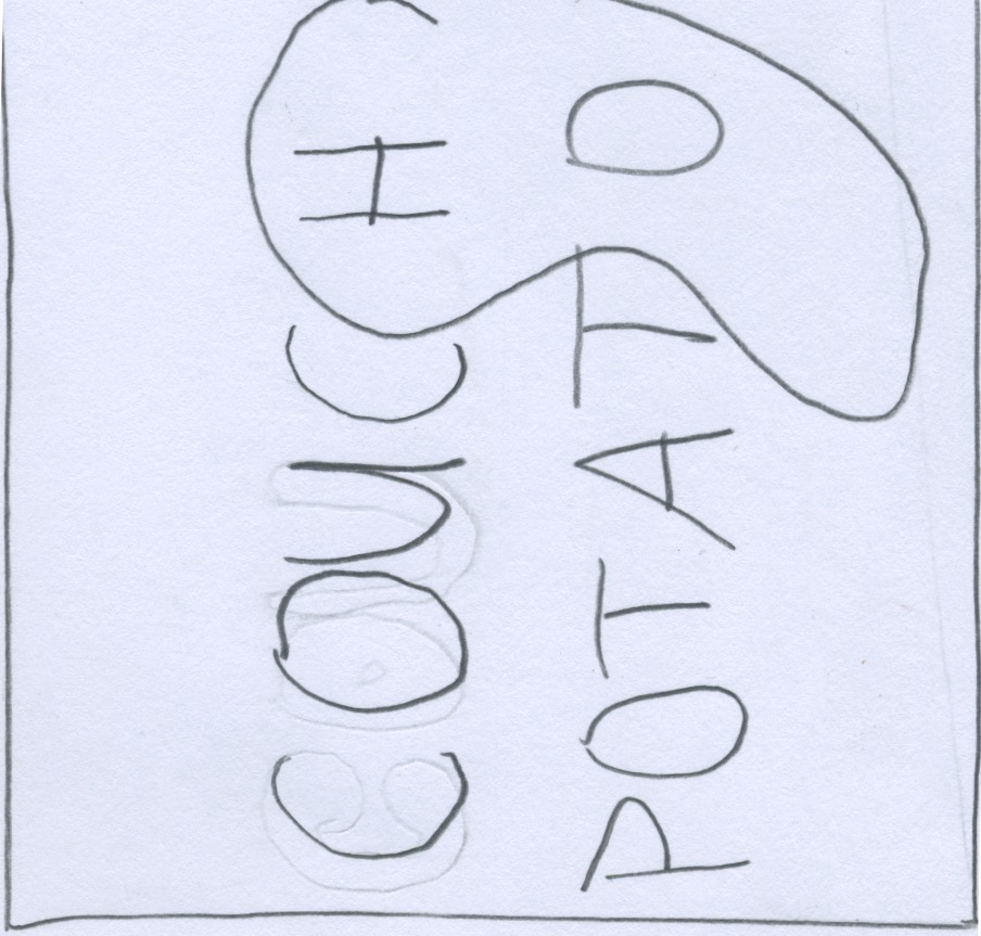
1. Couch Potato
Couch Potato is a dine in and out restaurant that serves potatoes cooked in different forms (mashed potatoes, tater tots, french fries, baked potatoes ect.) and allows you to choose from tons of different toppings (sour cream, bacon, cheese, vegetables ect.) to add to your potato dish.
2. Kiducation
My Kiducation is an iphone app that converts current events to interactive children stories. It creates educational stories that teaches children about current events. Kiducation is an interactive television program for kids which also serves as an effective learning tool to keep children better informed.
3. MountIn
MountIn is an indoor mountain that allows people to ski and snowboard all year round. The ability to control the climate in this enclosed area makes for the freshest powdered snow.
4. WiseFi
WiseFi is a wireless internet network that allows you to access the internet while flying on an airplane. Whether it be through your computer or cell phone, you can connect to the web for the convenient price of just $3.00.
5. Breathalyzer-to-go
Breathalyzer-to-go is a pocket sized breathalyzer that reads your blood alcohol level with the convenience of its size. This tool will help people keep track of how drunk they are actually getting and help prevent black outs. It can conveniently fit inside a typical pant pocket or purse making it easy and hassle free to bring out with you.
Subscribe to:
Posts (Atom)